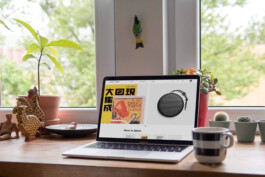
Color+form is a fictional boutique showcasing a carefully curated collection of periodicals and literature exploring art, culture, design and architecture, coupled with distinct home decor pieces.
UI&UX design
Diana Portela,
Rita Fontelo Oliveira
tutors
André Covas, João Lima and Catarina Garcia
course by
year
2018
This project was developed with Rita Fontelo Oliveira as part of a 5-month EDIT user interface and user experience intensive course. We did a survey, UX research, created a persona, did a user journey, did user testing and the visual design.
Our target audience are designers, architects, artists and anyone interested in art and culture.
competitor analysis
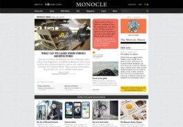
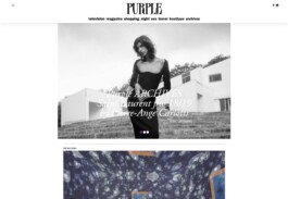
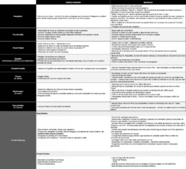
We started out by conducting a competitor analysis to define their weaknesses and strengths and our opportunities and threats.
Having a lot of online book stores out there, we decided to focus only on two of them: Monocle and Purple Fashion.
brainstorming and ideation
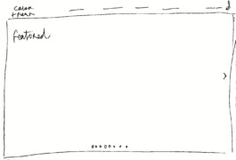
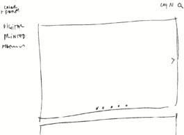
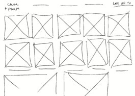
1.
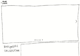
I started sketching some concepts very quickly to let the ideas flow.
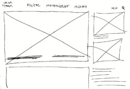
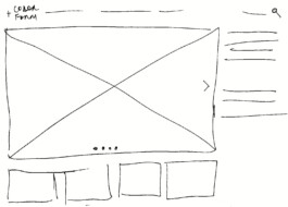
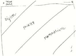
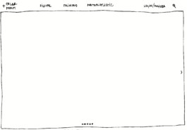
2.
Then I chose the three ideas with more potential and developed them a bit further.
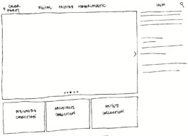
3.
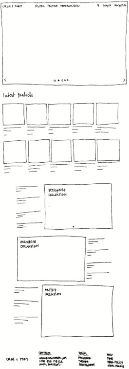
Using the same process, out of the three ideas, I selected only one and sketched it in more detail. This became our temporary design – a starting point.
Then, was time to confront and question the assumptions with some data.
survey
Through a Google docs survey
conducted on 16 people,
we intended to find out:
– Is online shopping a regular customer choice?
– Are e-books desired and ordered frequently?
– Is an advanced product search valued?
– Is it important to keep a wishlist and why? Are these shared with others?
– What device is used to make the purchase?
– What are the preferred paying methods?
Our data revealed that:
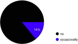
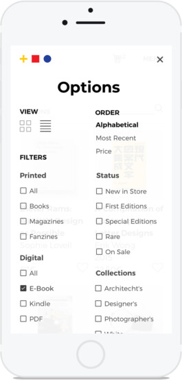
14% purchase e-books occasionally, while 86% never do.
Do you buy e-books?
It's also possible to find them through the filters.
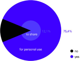
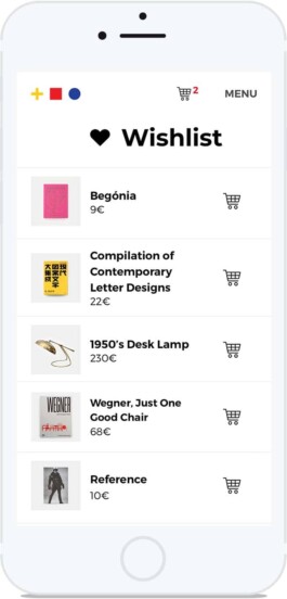
Wishlists are a valued feature, but mostly for personal use.
Is it important for you to keep a wishlist?
user persona
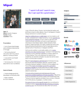
Using the results from the survey, we created a persona that embodied the traits of the target audience.
ux journey
We imagined a scenario where someone who already knew the color+form website was browsing through it and was looking for a present to offer a friend in his upcoming birthday.
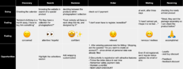
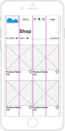
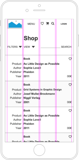
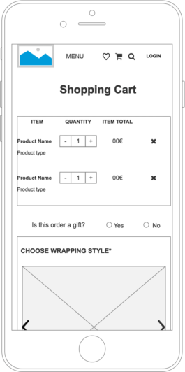
wireframes
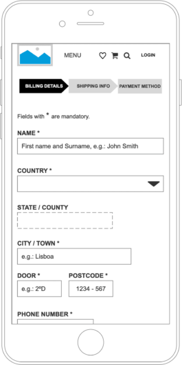
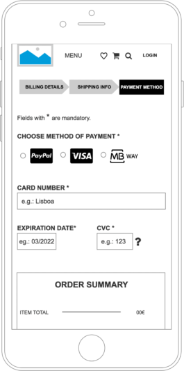
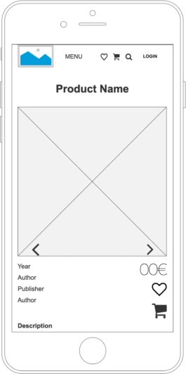
prototypes
Homepage
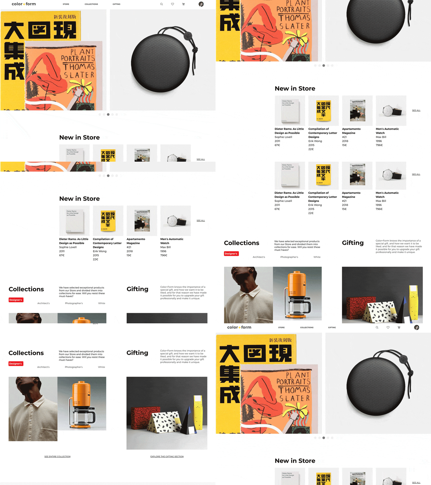
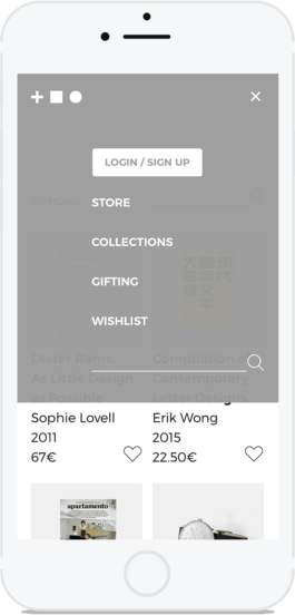
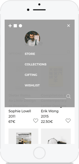
Store
thumbnail view
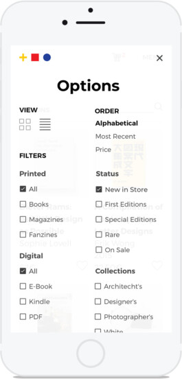
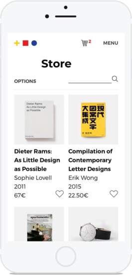
Store
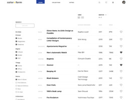
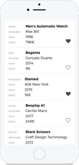
list view
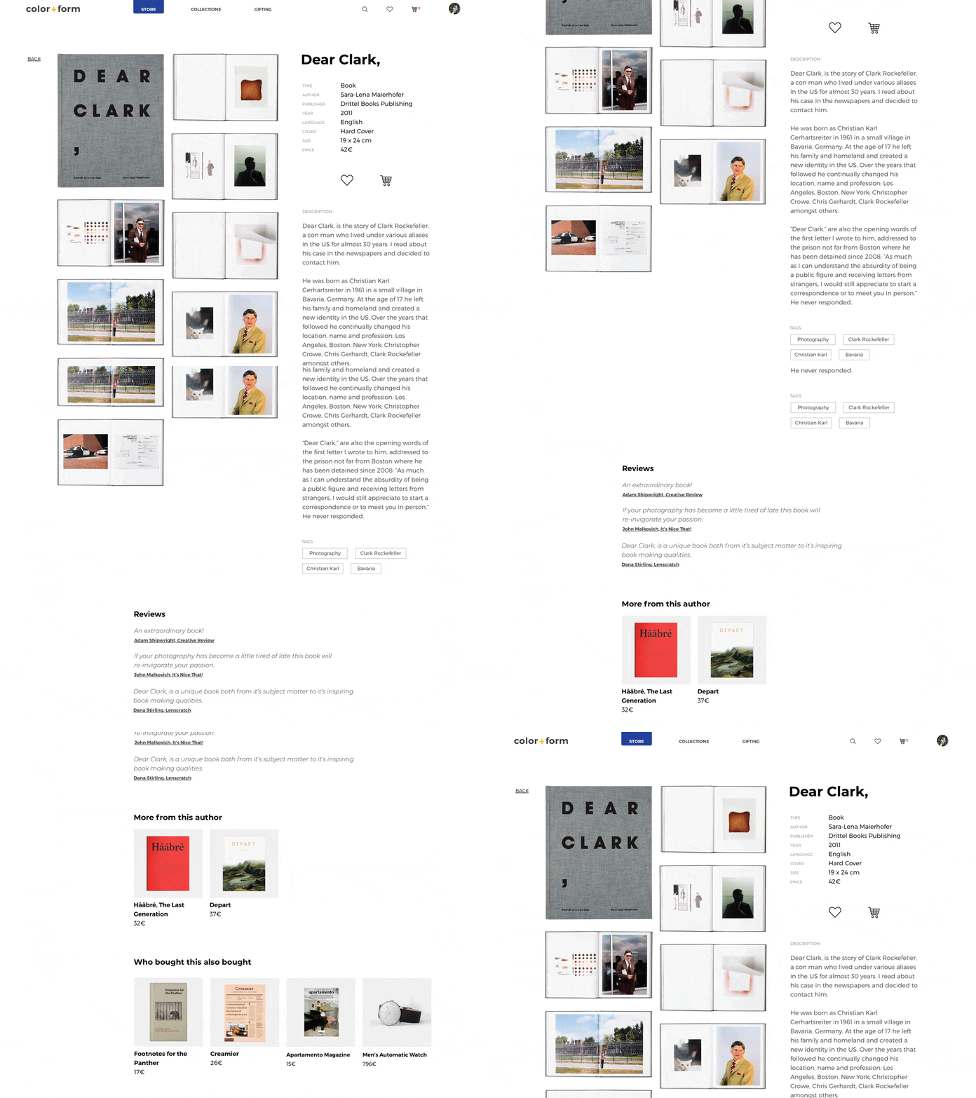
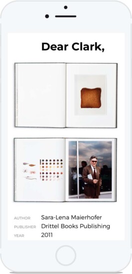
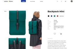
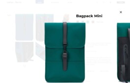
Product page
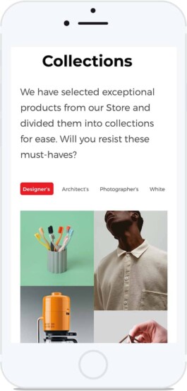
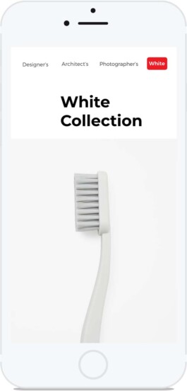
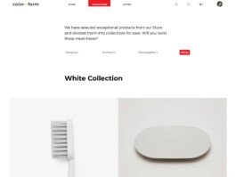
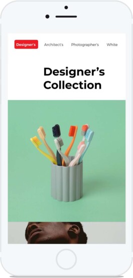
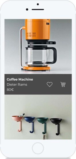
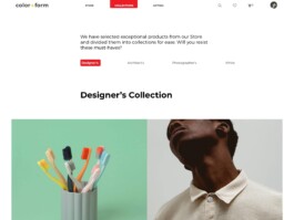
Collections
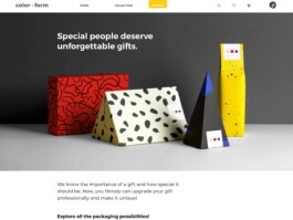
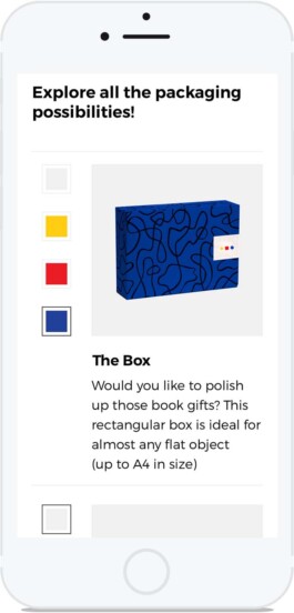
Gifting
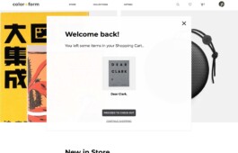
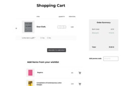
Shopping Cart
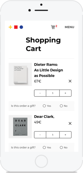
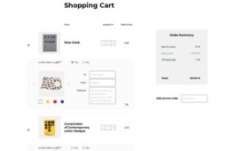
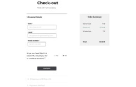
Checkout
Easy checkout without login.
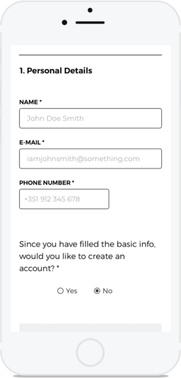
Step by step checkout. It is also possible to overview the information from the previous steps and edit it, if necessary.
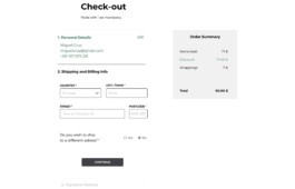
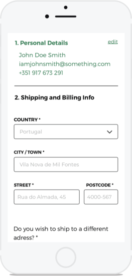
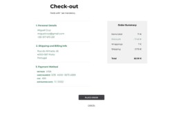
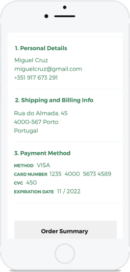
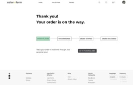
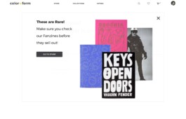
At the end of the checkout, a pop appears, showing rare or low in-stock items.
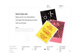
Newsletter pop-up
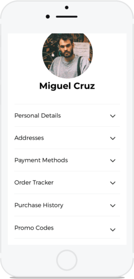
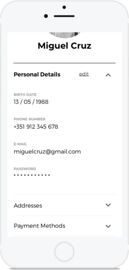
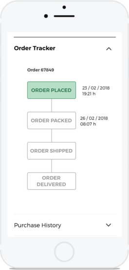
Profile
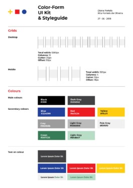
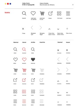
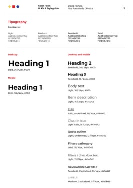
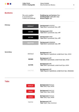
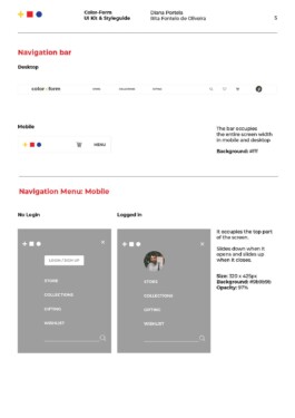
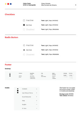
UI Kit
Color+Form

Color+form is a fictional boutique showcasing a carefully curated collection of periodicals and literature exploring art, culture, design and architecture, coupled with distinct home decor pieces.
UI&UX design
Diana Portela,
Rita Fontelo Oliveira
tutors
André Covas, João Lima and Catarina Garcia
course by
year
2018
This project was developed with Rita Fontelo Oliveira as part of a 5-month EDIT user interface and user experience intensive course. We did a survey, UX research, created a persona, did a user journey, did user testing and the visual design.
Our target audience are designers, architects, artists and anyone interested in art and culture.
competitor analysis
We started out by conducting a competitor analysis to define their weaknesses and strengths and our opportunities and threats.
Having a lot of online book stores out there, we decided to focus only on two of them: Monocle and Purple Fashion.


brainstorming and ideation


1.
I started sketching some concepts very quickly to let the ideas flow.


2.
Then I chose the three ideas with more potential and developed them a bit further.


3.
Using the same process, out of the three ideas, I selected only one and sketched it in more detail. This became our temporary design – a starting point.
Then, was time to confront and question the assumptions with some data.

survey
Through a Google docs survey
conducted on 16 people,
we intended to find out:
– Is online shopping a regular customer choice?
– Are e-books desired and ordered frequently?
– Is an advanced product search valued?
– Is it important to keep a wishlist and why? Are these shared with others?
– What device is used to make the purchase?
– What are the preferred paying methods?
Our data revealed that:
14% purchase e-books occasionally, while 86% never do.
Do you buy e-books?

It's also possible to find them through the filters.

Wishlists are a valued feature, but mostly for personal use.
Is it important for you to keep a wishlist?


user persona
Using the results from the survey, we created a persona that embodied the traits of the target audience.

wireframes


prototypes


UI Kit


previous archifutures
↑
next pôr a mesa