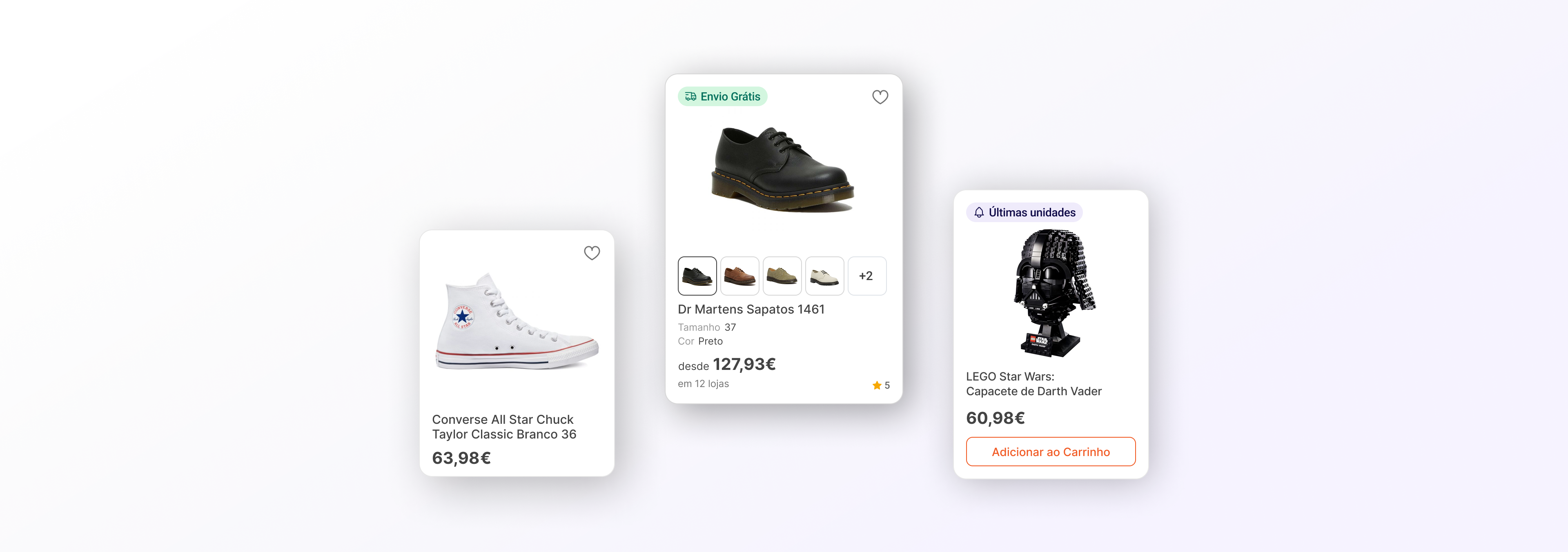
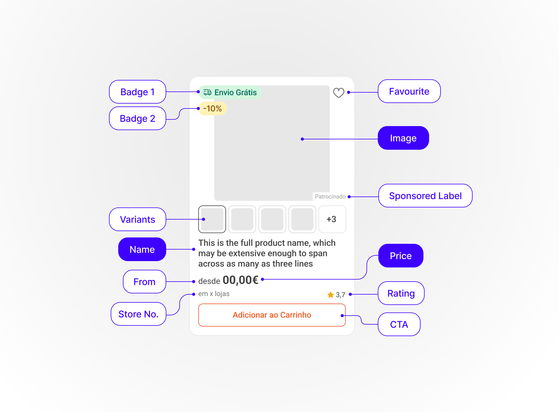
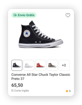
Short Variant
Need to discover:
generate curiosity and encourage exploration
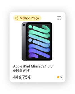
use
– Homepage
– Related Products carrousel
– Category Pages
– App Search Page
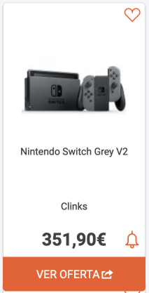
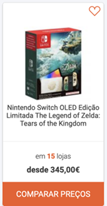
Full Variant
Need to evaluate:
support detailed search and product comparison
use on catalogue pages:
– Search results page
– "Best Prices" page
– Subcategory Page
– Brand Page
– Store Page
Add-to-cart Variant
Need to act quickly:
enable fast decisions
with clear call-to-action
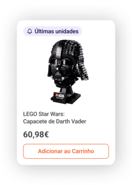
use:
– Cross-selling
– Related products section
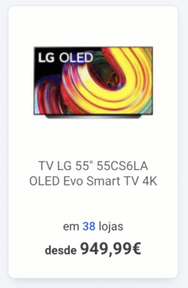
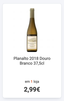
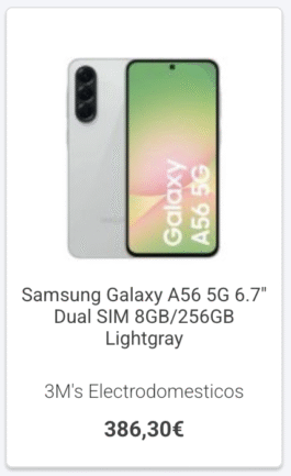
A lack of a strategy led to fragmented user journeys, with the same component varying in layout, interaction patterns and navigation across pages and devices.
This confused users and complicated the decision-making process.
Internally, design and engineering teams had to manage multiple versions of the same component, leading to more inconsistencies, duplicated effort and making the system harder to maintain and scale.