Product Card
Unifying the product card experience across a growing marketplace
As KuantoKusta’s marketplace expanded, the product card became inconsistent across pages and devices. Variations in layout, interaction patterns and navigation created fragmented user journeys, confusing users and slowing decision-making.
UI&UX design
Diana Portela
client
KuantoKusta
year
2024
Multiple versions of the same component increased design and engineering effort, amplified inconsistencies, and made the system harder to maintain and scale. There was no cohesive strategy guiding how the card should behave across contexts, resulting in duplicated work and unpredictable user experiences.
Goals
– Align the product card design with user needs and behavior patterns
– Increase clarity and usability across devices
– Support different user intentions: discovery, evaluation and purchase
– Create modular and adaptable card variants
– Enable platform scalability and improve conversion
Process
The redesign began with competitive and user research, including behavioral mapping, journey analysis and review of analytics. Three distinct shopping behaviors emerged as the foundation for design decisions:
– Discover – Generate curiosity and encourage exploration
– Evaluate – Support detailed search, product comparison and information scanning
– Act quickly – Enable fast decisions with clear calls to action
Based on these behaviors, I designed three product card variants tailored to these needs. Iterative testing and stakeholder reviews refined the layouts, hierarchy, and interactions for clarity, consistency and usability.
Challenges
– Balancing content density with visual clarity
– Ensuring consistency across responsive layouts
– Managing business and technical constraints while introducing design flexibility
Solution
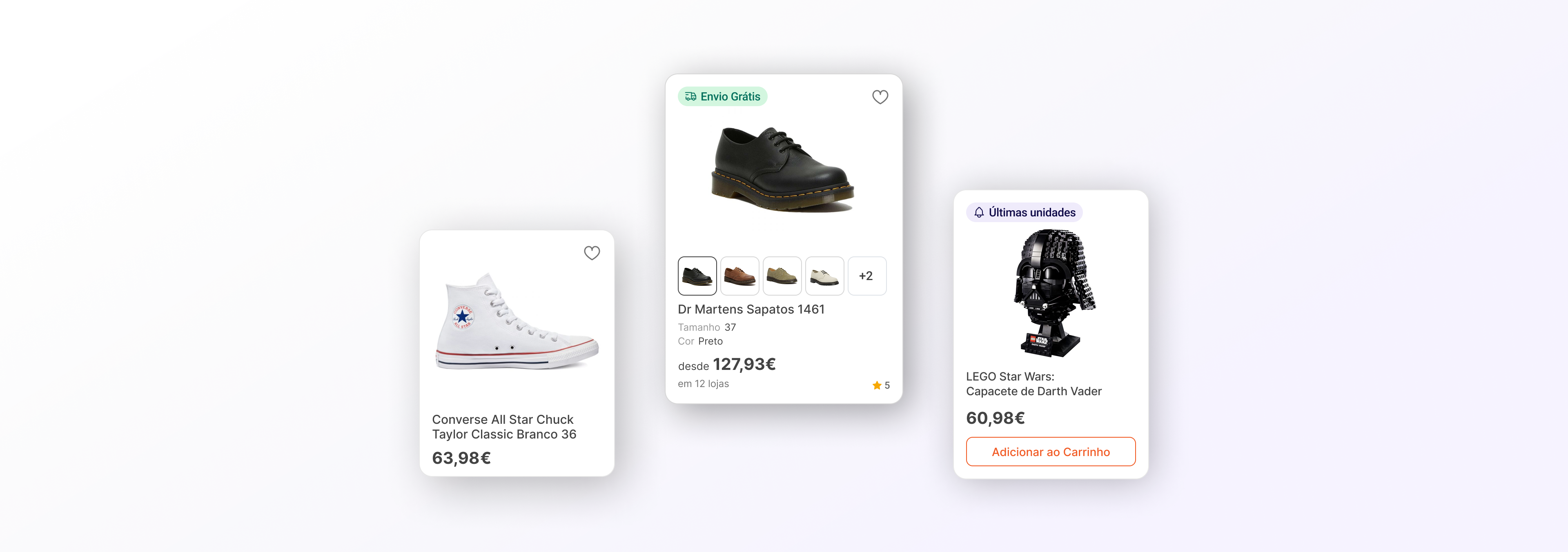
Primitive Card
The card was designed as a single component that accommodates several properties
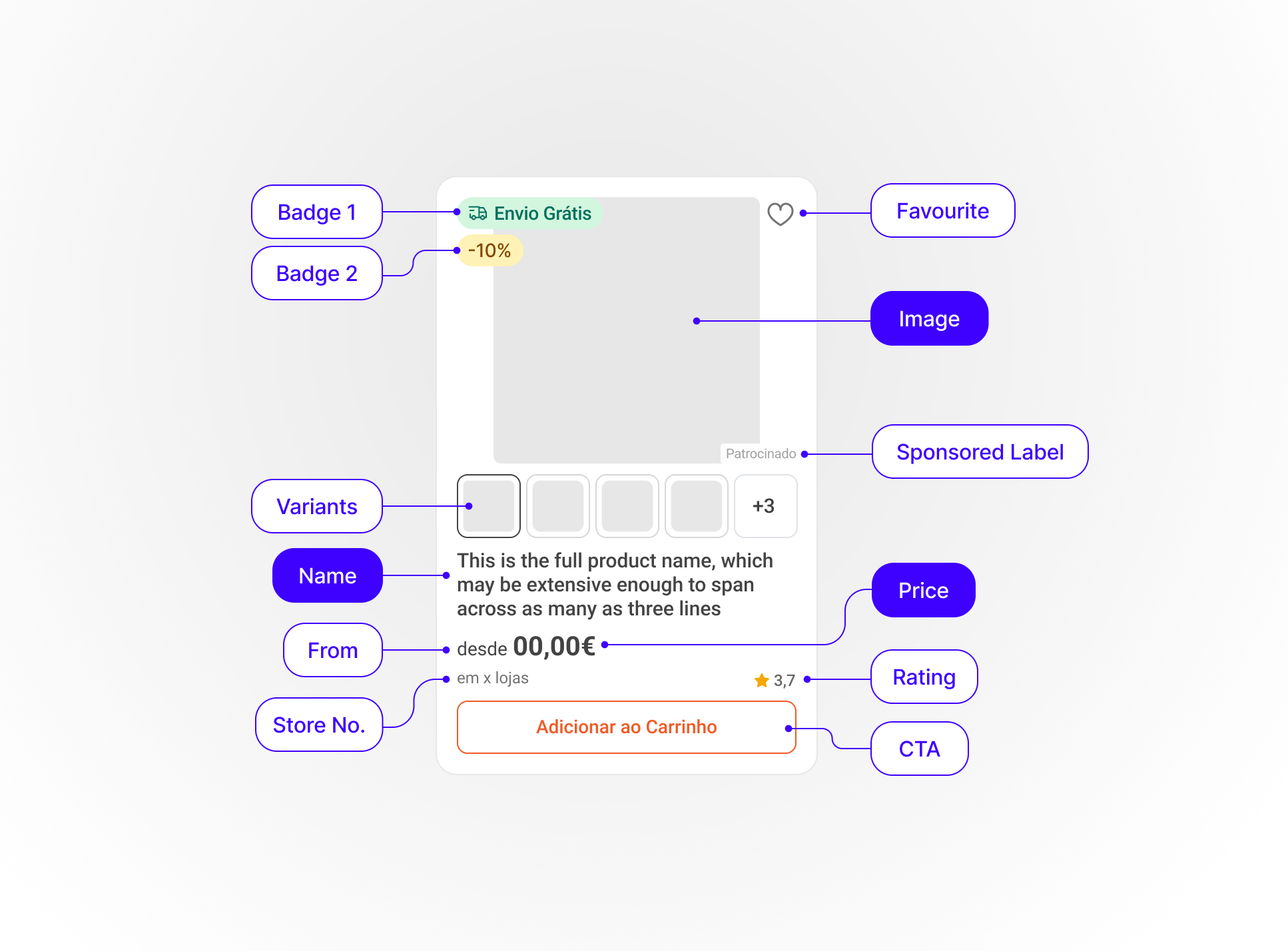
Certain elements are mandatory, whereas others may or may not be visible depending on context.
Mandatory
· Name
· Image
· Price
Optional
· Favourite
· Badge 1
· Badge 2
· Rating
· From
· Store No./ Store Name
· Variations
· CTA
· Sponsored Label
I designed three product card variants,
each addressing a specific user need:
Short Variant
(Discover)
Generate curiosity and encourage exploration
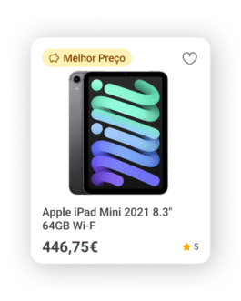
use
– Homepage
– Related Products carrousel
– Category Pages
– App Search Page
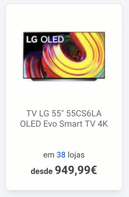
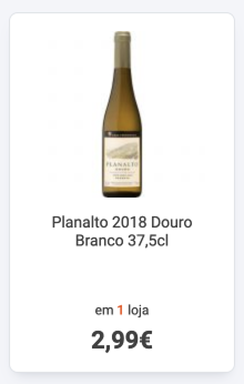
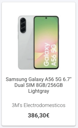
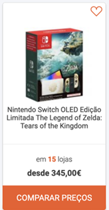
Full Variant
(Evaluate)
Support detailed search and product comparison
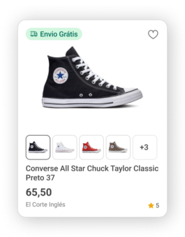
use on catalogue pages:
– Search results page
– "Best Prices" page
– Subcategory Page
– Brand Page
– Store Page
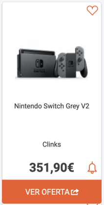
Add-to-cart Variant
(Act quickly)
Enable fast decisions
with clear call-to-action
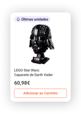
use:
– Cross-selling
– Related products section
Impact
- Reduced user friction on redundant and unpredictable behaviours
- Lowered design and development maintenance effort
- Easier browsing and faster purchase decisions across devices
- New features for comparing products:
· Rating
· Sponsored Badge
· Labels
· CTA
· Variations - Foundation for future scalability
The project aligned the product card with user behavior, improved clarity across devices, and created modular variants for discovery, evaluation and quick action – built for scalability.
previous error messages
↑
Product Card
Unifying the product card experience across a growing marketplace
As KuantoKusta’s marketplace expanded, the product card became inconsistent across pages and devices. Variations in layout, interaction patterns and navigation created fragmented user journeys, confusing users and slowing decision-making.
UI&UX design
Diana Portela
client
KuantoKusta
year
2024
Multiple versions of the same component increased design and engineering effort, amplified inconsistencies, and made the system harder to maintain and scale. There was no cohesive strategy guiding how the card should behave across contexts, resulting in duplicated work and unpredictable user experiences.
Goals
– Align the product card design with user needs and behavior patterns
– Increase clarity and usability across devices
– Support different user intentions: discovery, evaluation and purchase
– Create modular and adaptable card variants
– Enable platform scalability and improve conversion
Process
The redesign began with competitive and user research, including behavioral mapping, journey analysis and review of analytics. Three distinct shopping behaviors emerged as the foundation for design decisions:
– Discover – Generate curiosity and encourage exploration
– Evaluate – Support detailed search, product comparison and information scanning
– Act quickly – Enable fast decisions with clear calls to action
Based on these behaviors, I designed three product card variants tailored to these needs. Iterative testing and stakeholder reviews refined the layouts, hierarchy, and interactions for clarity, consistency and usability.
Challenges
– Balancing content density with visual clarity
– Ensuring consistency across responsive layouts
– Managing business and technical constraints while introducing design flexibility
Solution
Primitive Card
The card was designed as a single component that accommodates several properties
Certain elements are mandatory, whereas others may or may not be visible depending on context.
Mandatory
· Name
· Image
· Price
Optional
· Favourite
· Badge 1
· Badge 2
· Rating
· From
· Store No./ Store Name
· Variations
· CTA
· Sponsored Label
I designed three product card variants,
each addressing a specific user need:
Short Variant
(Discover)
Generate curiosity and encourage exploration
use
– Homepage
– Related Products carrousel
– Category Pages
– App Search Page
Full Variant
(Evaluate)
Support detailed search and product comparison
use on catalogue pages:
– Search results page
– "Best Prices" page
– Subcategory Page
– Brand Page
– Store Page
Add-to-cart Variant
(Act quickly)
Enable fast decisions
with clear call-to-action
use:
– Cross-selling
– Related products section
Impact
- Reduced user friction on redundant and unpredictable behaviours
- Lowered design and development maintenance effort
- Easier browsing and faster purchase decisions across devices
- New features for comparing products:
· Rating
· Sponsored Badge
· Labels
· CTA
· Variations - Foundation for future scalability
The project aligned the product card with user behavior, improved clarity across devices, and created modular variants for discovery, evaluation and quick action – built for scalability.
previous error messages
↑