This project was developed while working at colönia design studio, under the creative direction of Joana Machado.
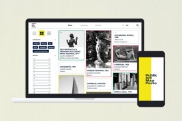
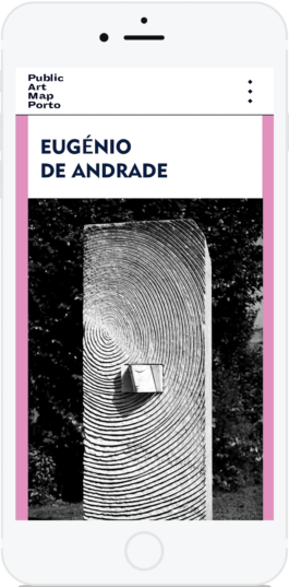
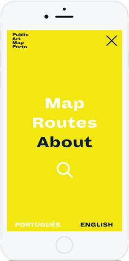
It consisted of designing the digital interface of the existing printed version of the Public Art Map Porto, optimized for mobile and desktop devices. Porto City Hall commissioned it and is currently in the development phase.
creative direction
Joana Machado, colönia
UI&UX design
Diana Portela
client
Câmara Municipal do Porto
year
2020
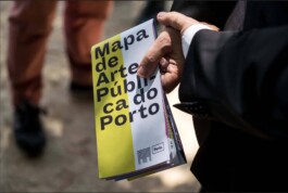
Launched by the Porto City Hall in 2017, the printed map is available in English and Portuguese and can be found at no cost at the tourist offices around the city and at the airport.
It references more than 200 sculptures and panels of public art from the last 150 years. It is "a true open-air museum in which the whole city can get involved", as Rui Moreira puts it.
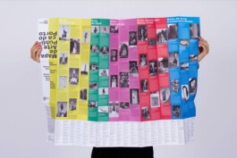
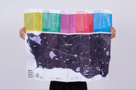
It is foldable and can be carried around the city to discover its History through the eyes of Art.
However, the 100x70cm map may prove impractical for on-the-go exploration. Constantly flipping between the front and back to access both the map and artwork descriptions, as required for following suggested routes, could be cumbersome. A digital solution, on the other hand, would effortlessly handle this task.
Map
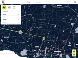
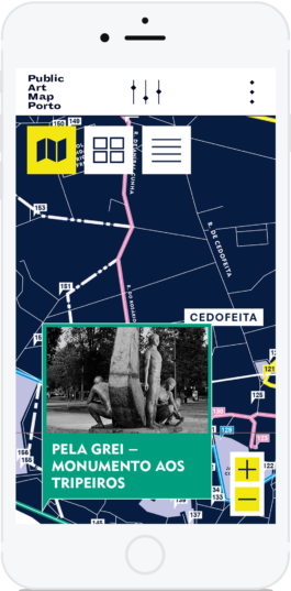
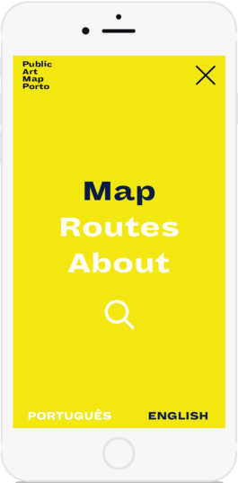
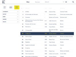
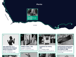
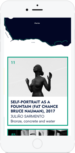
To make navigation easier, the artworks can be accessed in three different ways: via the points marked on the map, through a thumbnail view, or by selecting the list view.
Map view
Thumbnail view
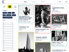
List view
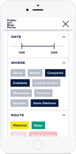
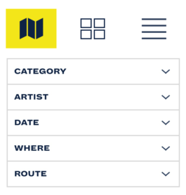
I also proposed some filtering options to help the users narrow their searches: it is possible to select the artworks by autor, category, select a time frame, place (Porto's districts) and by route.
Filtering options
Default:
Menus closed
Default:
When open
Filtering example


Routes
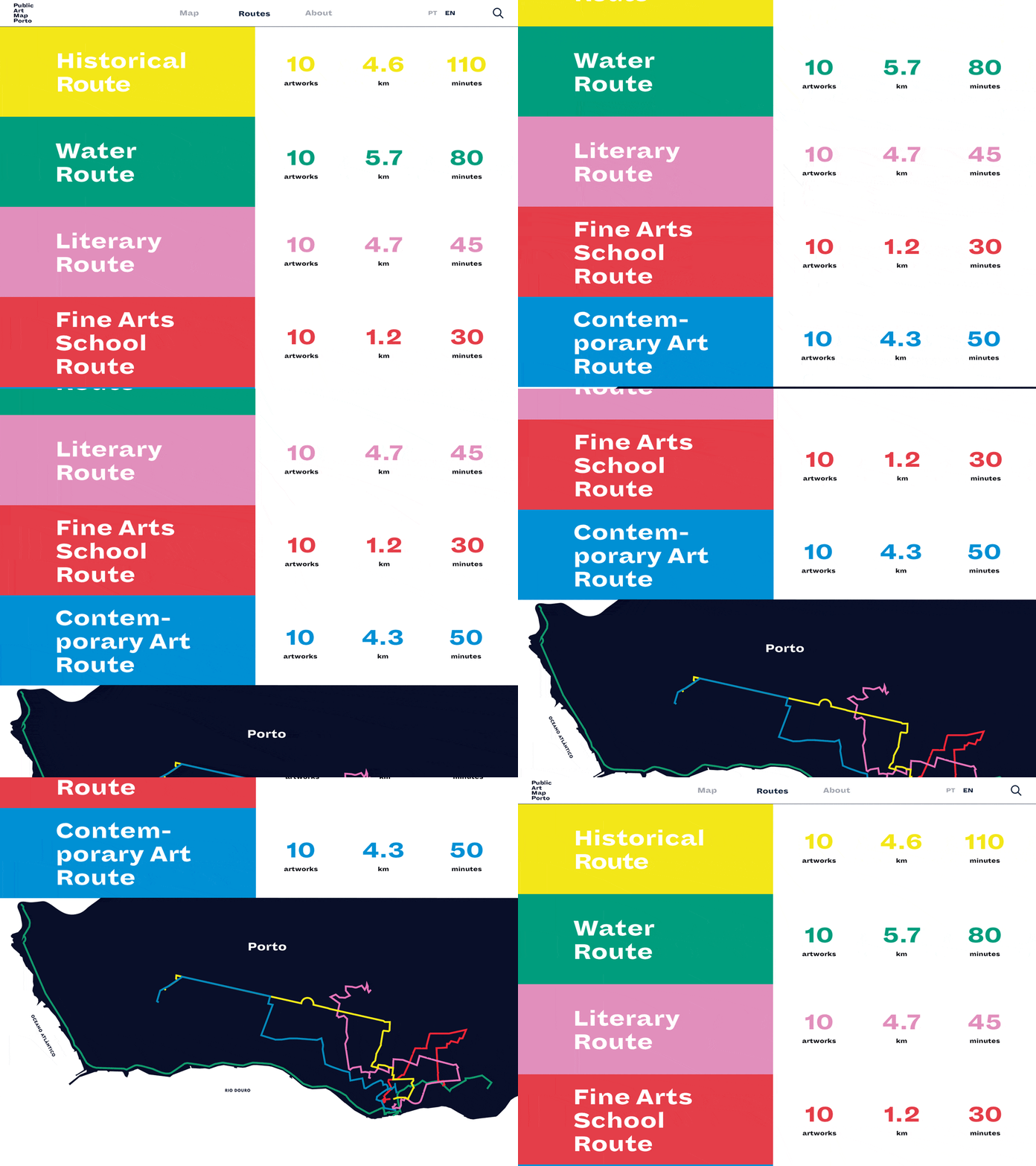
There are countless possible circuits and five curated suggestions. Five thematic routes: Historical, Water, Literary, Fine Arts School and Contemporary Art Route.
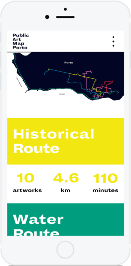
Water Route
Artworks
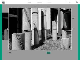
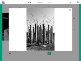
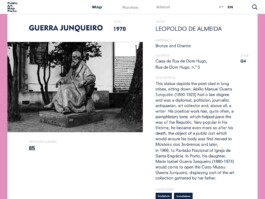
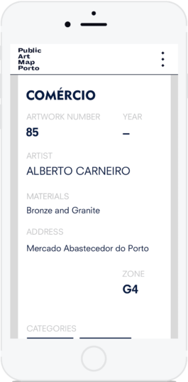
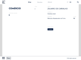
The map references 216 artworks and 50 of them are part of the thematic routes (five routes with ten artworks each). These artworks also have a description, an image or more, and were marked with the contrasting colours already present on the printed map.
Water Route
yellow
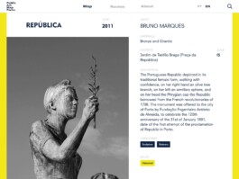
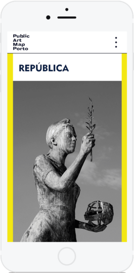
Historical Route
green
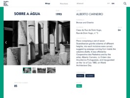
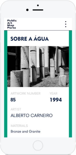
Literary Route
pink
Fine Arts School Route
red
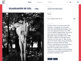
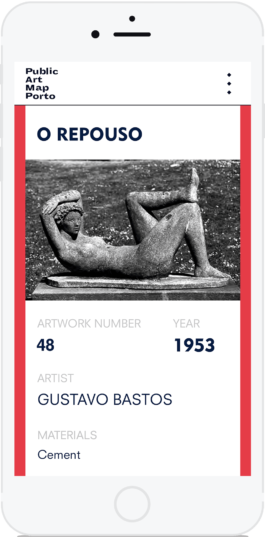
Contemporary Art Route
blue
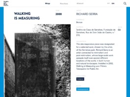
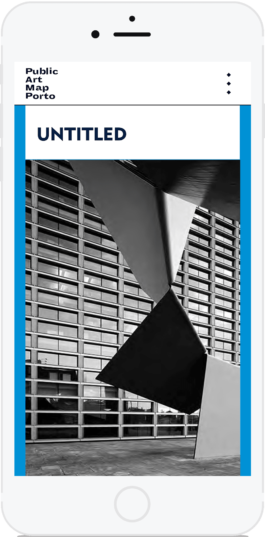
The remaining artworks – which do not belong to any of the routes – are listed on an index at the bottom in the printed map. They don't have any description or images. I attributed them a neutral grey colour.
No Route
grey
About
Public Art Map Porto

This project was developed while working at colönia design studio, under the creative direction of Joana Machado.
It consisted of designing the digital interface of the existing printed version of the Public Art Map Porto, optimized for mobile and desktop devices. Porto City Hall commissioned it and is currently in the development phase.
ui&ux
creative direction
Joana Machado, colönia
UI&UX design
Diana Portela
client
Câmara Municipal do Porto
year
2020

Launched by the Porto City Hall in 2017, the printed map is available in English and Portuguese and can be found at no cost at the tourist offices around the city and at the airport.
It references more than 200 sculptures and panels of public art from the last 150 years. It is "a true open-air museum in which the whole city can get involved", as Rui Moreira puts it.


It is foldable and can be carried around the city to discover its History through the eyes of Art.
However, the 100x70cm map may prove impractical for on-the-go exploration. Constantly flipping between the front and back to access both the map and artwork descriptions, as required for following suggested routes, could be cumbersome. A digital solution, on the other hand, would effortlessly handle this task.
Map
To make navigation easier, the artworks can be accessed in three different ways: via the points marked on the map, through a thumbnail view, or by selecting the list view.
Map view


Thumbnail view


List view

Filtering options
Default:
Menus closed
Default:
When open
Filtering example


Routes
There are countless possible circuits and five curated suggestions. Five thematic routes: Historical, Water, Literary, Fine Arts School and Contemporary Art Route.


Water Route


Artworks
Water Route
yellow


Historical Route
green


Literary Route
pink


Fine Arts School Route
red

Contemporary Art Route
blue


The remaining artworks – which do not belong to any of the routes – are listed on an index at the bottom in the printed map. They don't have any description or images. I attributed them a neutral grey colour.
No Route
grey


About


↑
previous sonic urbanism
next &beyond collective