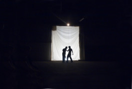
Graphic identity for the theatre play A tragédia do rei Ricardo III, adapted from William Shakespeare's Richard III by the theatre company A Filantrópica, from Póvoa de Varzim, in 2011.
It was presented on an abandoned bus terminal, in a mixture between the old and the new – a classical tragedy on a modern, industrial and decaying scenery. This interpretation of the play explored the multiple sides of Richard III's personality and some surreal points of the narrative.
creative direction and design
Diana Portela, Daniela Barbeira and Telmo Parreira
client
year
2011
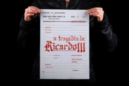
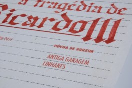
Main Posters

The project included several graphic pieces and two promotional vídeos, one of them made to display on the publicity screens of Metro do Porto.
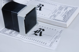
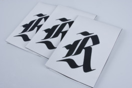
We centred our graphic approach in the image of play's main characters combined with the strength of Gothic calligraphy. We also explored type variations and, on the video, disturbing effects, getting closer to this version's approach to the play. The show site also took a big part in the communication strategy: we found a lot of old graphic pieces through the terminal, such as timetable records and accounting-paper blocks, and used them as a starting point for the posters and tickets.
All the video footage and photography used in the promotional campaign was recorded by us during the rehearsals of the play. All the calligraphy was hand-drawn by me, especially for this work.
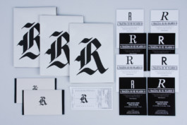
Flyers
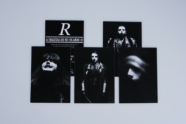
Invitation
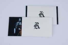
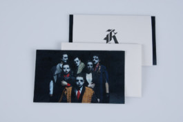
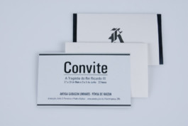
Tickets
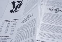
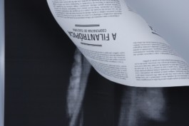
Exhibition Guide

Ricardo III

Graphic identity for the theatre play A tragédia do rei Ricardo III, adapted from William Shakespeare's Richard III by the theatre company A Filantrópica, from Póvoa de Varzim, in 2011.
It was presented on an abandoned bus terminal, in a mixture between the old and the new – a classical tragedy on a modern, industrial and decaying scenery. This interpretation of the play explored the multiple sides of Richard III's personality and some surreal points of the narrative.
branding, editorial
creative direction and design
Diana Portela, Daniela Barbeira and Telmo Parreira
client
year
2011


Main Posters

The project included several graphic pieces and two promotional vídeos, one of them made to display on the publicity screens of Metro do Porto.
We centred our graphic approach in the image of play's main characters combined with the strength of Gothic calligraphy. We also explored type variations and, on the video, disturbing effects, getting closer to this version's approach to the play. The show site also took a big part in the communication strategy: we found a lot of old graphic pieces through the terminal, such as timetable records and accounting-paper blocks, and used them as a starting point for the posters and tickets.
All the video footage and photography used in the promotional campaign was recorded by us during the rehearsals of the play. All the calligraphy was hand-drawn by me, especially for this work.

Flyers

Invitation


Tickets

Exhibition Guide


↑