I redesigned KuantoKusta’s error pages to turn moments of frustration into opportunities for clarity, empathy and brand connection.
UI&UX design
Diana Portela
client
KuantoKusta
year
2023
problem statement
The existing error pages were lacking clarity and information, as users didn't understand what went wrong or how to fix it. On top of this, they were outdated and lacked brand alignment. All this lead to mistrust and poor user experience during error states.
goals
– Enhance the user experience during error states;
– Maintain a tone of voice aligned with KuantoKusta’s brand;
– Reduce frustration by providing clear next steps;
– Encourage users to stay on the site rather than drop off;
– Make technical issues feel human and approachable.
content strategy
– Simple language: avoiding technical jargon
– Empathy: Acknowledging the user's situation
– Call to action: Guiding the user on what to do next (e.g., "Refresh" and "Try again in a few minutes")
challenges
– Balancing technical accuracy with user-friendly language;
– Keeping visual design aligned with existing brand identity without overloading the page;
– Designing solutions that work responsively across devices, especially mobile;
– Ensuring accessibility for screen readers and visual contrast compliance.
solution
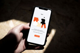
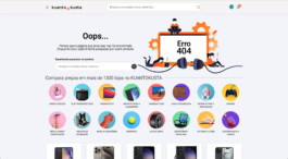
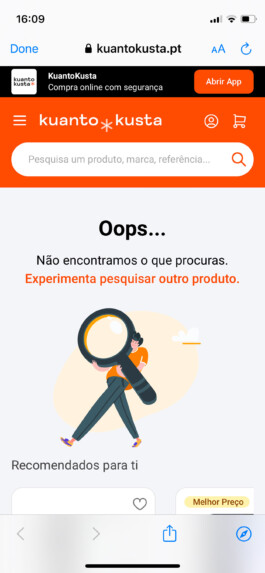
Error 404
Introduced a friendly illustration of someone searching, a clear explanation, and a search bar to redirect users.
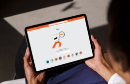
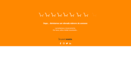
Error 500
Used a puzzle metaphor to humanize the error and included a refresh button as a clear recovery action.
impact
– A more positive and polished user experience
– Users have clear guidance: actionable steps are provided so they can to resolve the issue or try again
– Decrease in support tickets related to these specific errors.
Error messages
I redesigned KuantoKusta’s error pages to turn moments of frustration into opportunities for clarity, empathy and brand connection.
UI&UX design
Diana Portela
client
KuantoKusta
year
2023
problem statement
The existing error pages were lacking clarity and information, as users didn't understand what went wrong or how to fix it. On top of this, they were outdated and lacked brand alignment. All this lead to mistrust and poor user experience during error states.
goals
– Enhance the user experience during error states;
– Maintain a tone of voice aligned with KuantoKusta’s brand;
– Reduce frustration by providing clear next steps;
– Encourage users to stay on the site rather than drop off;
– Make technical issues feel human and approachable.
content strategy
– Simple language: avoiding technical jargon
– Empathy: Acknowledging the user's situation
– Call to action: Guiding the user on what to do next (e.g., "Refresh" and "Try again in a few minutes")
challenges
– Balancing technical accuracy with user-friendly language;
– Keeping visual design aligned with existing brand identity without overloading the page;
– Designing solutions that work responsively across devices, especially mobile;
– Ensuring accessibility for screen readers and visual contrast compliance.
solution
Error 404
Introduced a friendly illustration of someone searching, a clear explanation, and a search bar to redirect users.
Error 500
Used a puzzle metaphor to humanize the error and included a refresh button as a clear recovery action.
impact
– A more positive and polished user experience
– Users have clear guidance: actionable steps are provided so they can to resolve the issue or try again
– Decrease in support tickets related to these specific errors.
previous contigo
↑